Brand Identity: The Visual DNA of a Powerful Brand
The brand style guide is much more than a simple aesthetic document. It forms the true foundation of a company’s visual identity, helping to establish its presence and strengthen its credibility.
This reference document precisely defines how to use the key visual elements such as the logo, color palette, typography, and graphic elements to ensure visual consistency across all communication channels, including your website, social media, printed materials, emails, presentations, and product packaging.In this article, we explain in detail what a brand style guide is, why it is essential for building a strong brand, how to design it effectively, and which examples of brand guidelines can inspire you to create a visual identity that is both consistent, powerful, and memorable.

Definition and strategic role of a brand style guide
What is a brand style guide?
It is a true reference document that centralizes all the visual standards specific to a brand.
Its purpose is to maintain a consistent and professional image across all communication channels.
It generally includes:
- The logo: approved variations, dimensions, and usage restrictions (no distortion, overloading, or color inversion)
- Official colors: primary and secondary palettes with color codes (HEX, RGB, CMYK)
- Typography: fonts for titles and body text, allowed styles (bold, italic, uppercase)
- Secondary graphic elements: icons, textures, illustrations, and brand-specific visuals
- Layout rules: composition grids, margins, alignments, and visual hierarchy
Why your business needs a brand style guide
- Consistency: all your communication materials convey a unified and coherent image without any inconsistencies.
- Professional credibility: a well-defined visual identity strengthens trust among your clients and partners.
- Time efficiency: designers, developers, and marketing teams immediately know which elements to use, avoiding unnecessary back-and-forth.
- Stronger memorability: a strong identity sticks in people’s minds. According to neuromarketing studies, it increases brand recognition by more than 80%.
- Brand differentiation: in a saturated market, a unique visual identity helps you stand out and be easily recognizable.

Before you start: define the foundations of your brand identity
An effective brand style guide starts with a strong brand strategy aligned with your values, positioning, and objectives.
Before you design it, make sure to go through a few essential groundwork steps.
1. Mission
What is the promise you make to your clients? What problem do you actually solve?
This reflection is what guides the entire development of your visual identity.
2. Target audience
Who are your ideal clients? Which shapes, colors, or design styles speak to them the most? Knowing your audience helps you shape a visual identity that truly connects with them.
3. Positioning
Are you a premium, innovative, approachable, or sustainable brand? These personality traits must be clearly reflected in your visual identity.
4. Values and vision
Is your brand built on ethics, sustainability, innovation, or tradition? These foundations are essential to shape your design direction and anchor your visual identity in strong, authentic values.
5. What makes you different
Study your competitors carefully: how can you avoid looking like them and, above all, create a unique visual footprint that sets you apart in your market for the long term?

The key elements of a professional brand style guide
1. The logo
- Versions: color, black & white, monochrome, or icon-only variations to adapt to any medium.
- Minimum clear space: reserved area around the logo to ensure readability and visual impact.
- Do’s and don’ts: guidelines on proper and improper uses to preserve the brand’s visual integrity.

2. The color palette
- Primary and secondary colors: carefully selected to reflect the brand’s identity.
- Exact codes: essential formats for accurate reproduction (HEX, CMYK, RGB).
- Usage contexts: adapted to every medium — digital, print, packaging, and more.

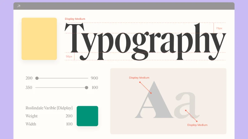
3. The typography
- Fonts: dedicated typography for titles, body text, and buttons.
- Sizes, weights, line spacing, and capitalization: precise rules for optimal readability and clear hierarchy.
- Usage adapted to both print and digital media for perfect consistency.
4. The visual universe
- Photography style: realistic, lifestyle, or monochrome to define the tone of your visuals.
- Illustration style: flat design, hand-drawn, or vector to create a consistent graphic universe.
- Visual treatment: use of filters, framing, and composition to strengthen visual impact.
5. The visual hierarchy & layout
- Grids, columns, and margins to structure your layouts with precision.
- Spacing and alignment rules to ensure perfect visual balance.
- Standard formats for posters, slides, and banners to adapt visuals to each medium.
6. The tone and style
- Editorial tone: professional, friendly, or expert to match your audience.
- Graphic style: clean, modern, classic, or vintage to reflect your brand’s personality.
Why entrust your brand style guide to Solentia?
At Solentia, we combine visual expertise, strategic thinking, and web performance.
Our approach:
- Tailor-made: We craft an identity that reflects your values and speaks to your audience.
- SEO-optimized: Your brand image is designed to perform online.
- Conversion-focused: A visual identity built to engage and persuade your visitors.

